.svg)
Explore Over 100+ IT Courses
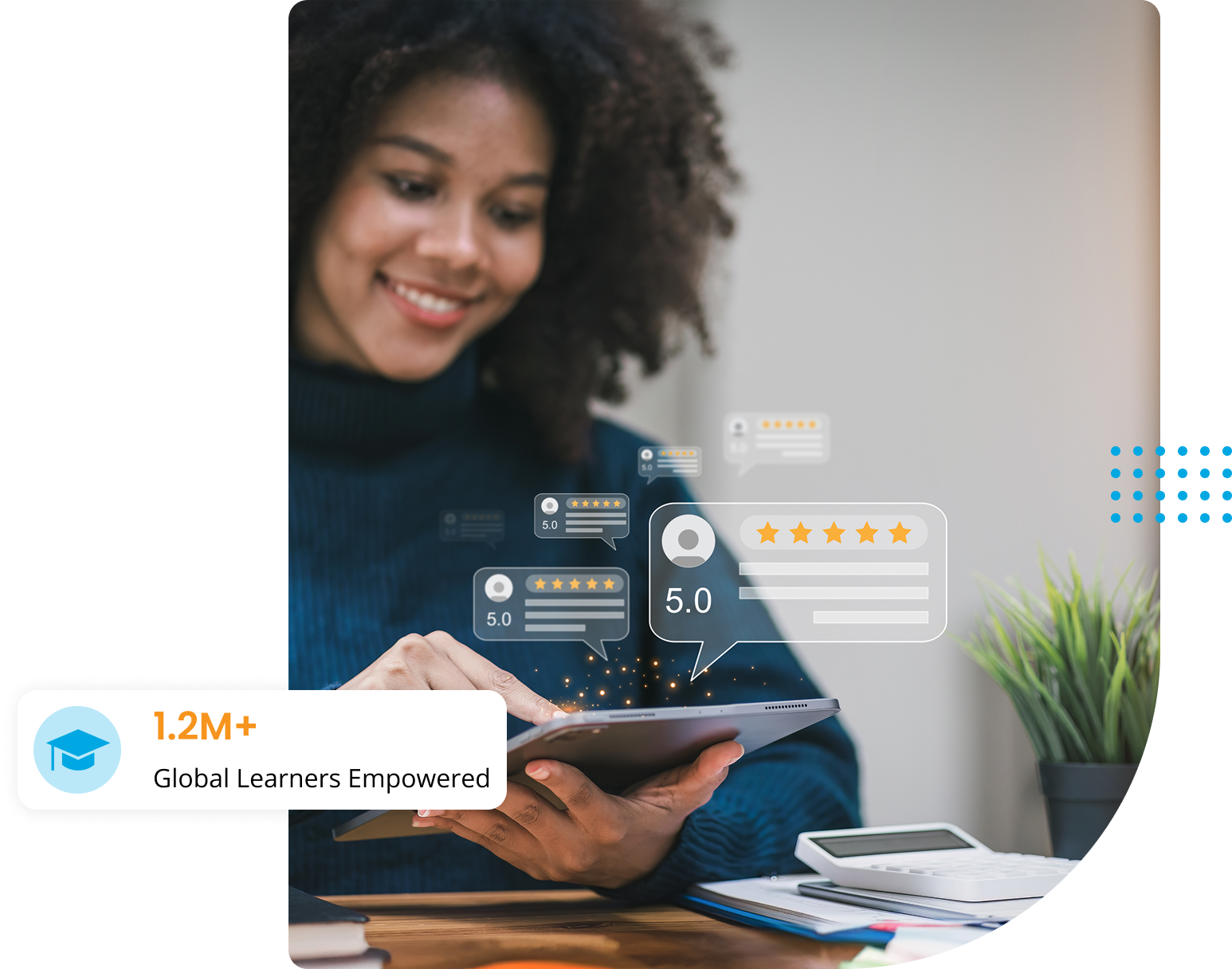
$100M+ in Salaries Earned
.svg)


.png)

.png)
Whether you're entering the I.T. industry or advancing your skills, Global I.T. provides top-tier, career-focused certification courses in Networking, Database Administration, Web Development, E-Commerce, Clerical, and Programming.
Designed for industry relevance and cost-effectiveness, our programs ensure you gain cutting-edge expertise. Plus, we go beyond training- offering staffing, web development, and I.T. consulting to support your career growth.
At Global Information Technology, your success is our commitment.
We stand by your certification, guiding you every step of the way.
.svg)
We accept Veterans Benefits, Post-9-11 GI Bill®, Voc Rehab, VET TEC, Montgomery GI Bill® Active Duty
.svg)
Providing the right skills for the right job at the right time.

Master machine learning, generative AI, and data-driven intelligence to become a job-ready AI engineer and land high-paying roles in cutting-edge tech.

The Trusted Choice for I.T. Professionals Since 1999. Flexible, professional-friendly schedules available.
This fun, online quiz takes 3 minutes to complete and you’ll get a personalized report. Identify your strengths and social style plus the training and positions you’re best suited for

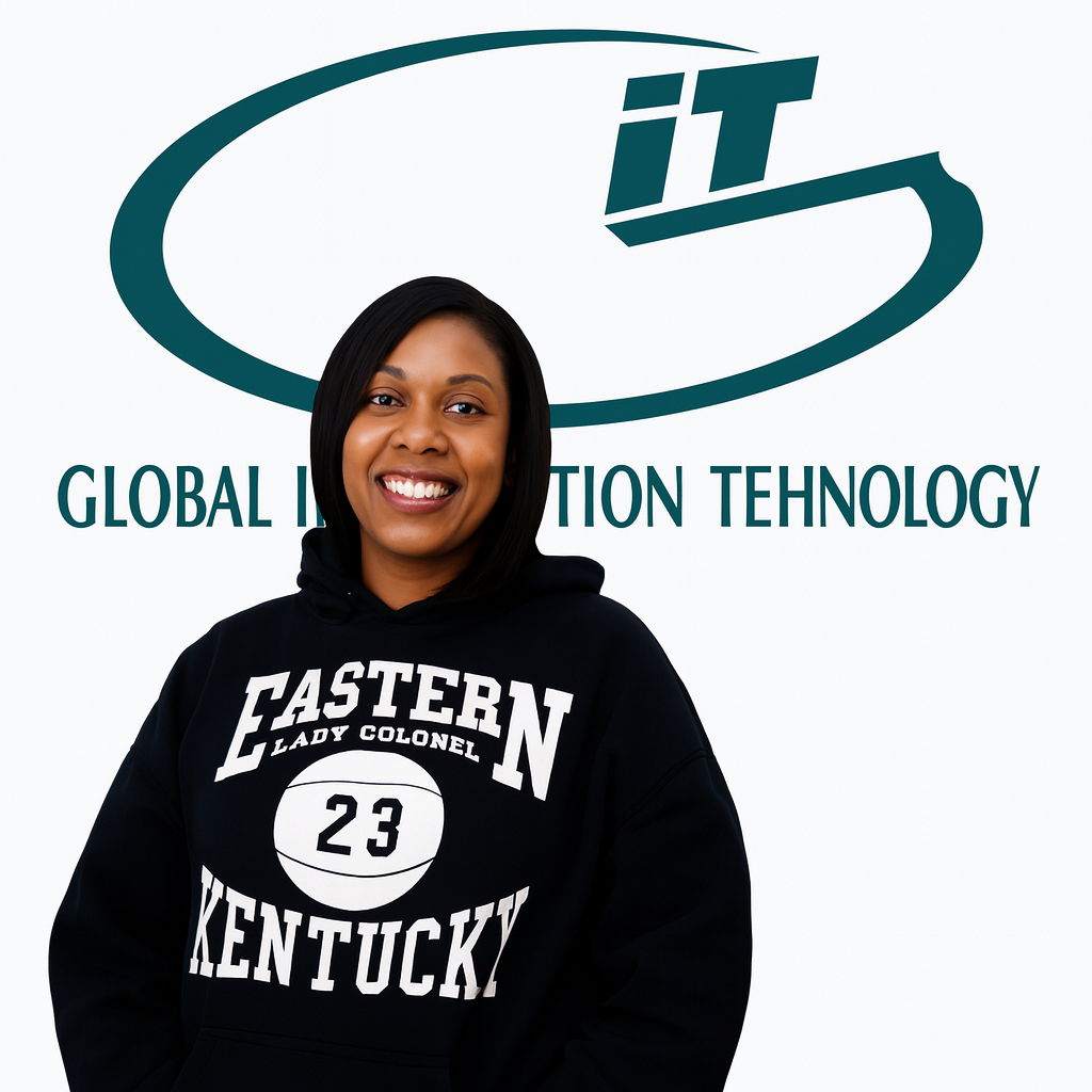
While serving in the military I often found myself interested in pursuing a career within IT. Shortly after exiting the military, I started my journey and landed a position as an apprentice with a global consulting firm.


I began taking the Windows 2000 MCSE track in June of 2001. I decided to check out GIT after hearing an ad on the radio, and after viewing the facilities I signed up immediately.

I joined Global IT’s Software QA & Testing, Oracle 12c SQL, and Oracle JAVA SE 8 programming from February 2018 to June 23, 2018. The Director at Global Information Technology tailored my courses to fit my career path and goals.
First of all I would like to start out by saying a big thank you to Global Information Technology who not only provided me with my CompTIA A+ and Network+ training, however they helped me to get full time employment with benefits.


Step into the dynamic world of I.T. with our structured Career Tracks, designed to equip you with in-demand skills and globally recognized certifications. Master specialized domains through structured learning paths featuring top-tier courses from authorized industry leaders like Cisco, CompTIA, PMI, IIBA, EC-Council, and Microsoft. Elevate your career with tailored tracks, each offering a deep dive into essential I.T. disciplines. Your journey to success starts here!
Kickstart learning of Data Science with Python Machine Learning and AI

Take the Internet of Things courses to build skills and advance career
Global Information Technology delivers industry-focused IT certification training through live, instructor-led sessions. Our programs are designed for working professionals, career changers, and students who want practical skills, real-world guidance, and globally recognized certifications—without the need for a physical campus.
Instructor-led sessions aligned with certification objectives
Hands-on practical exercises and real-world scenarios
Certification training courses and guided practice
Interactive learning with industry-experienced trainers
Ongoing student support throughout the training program


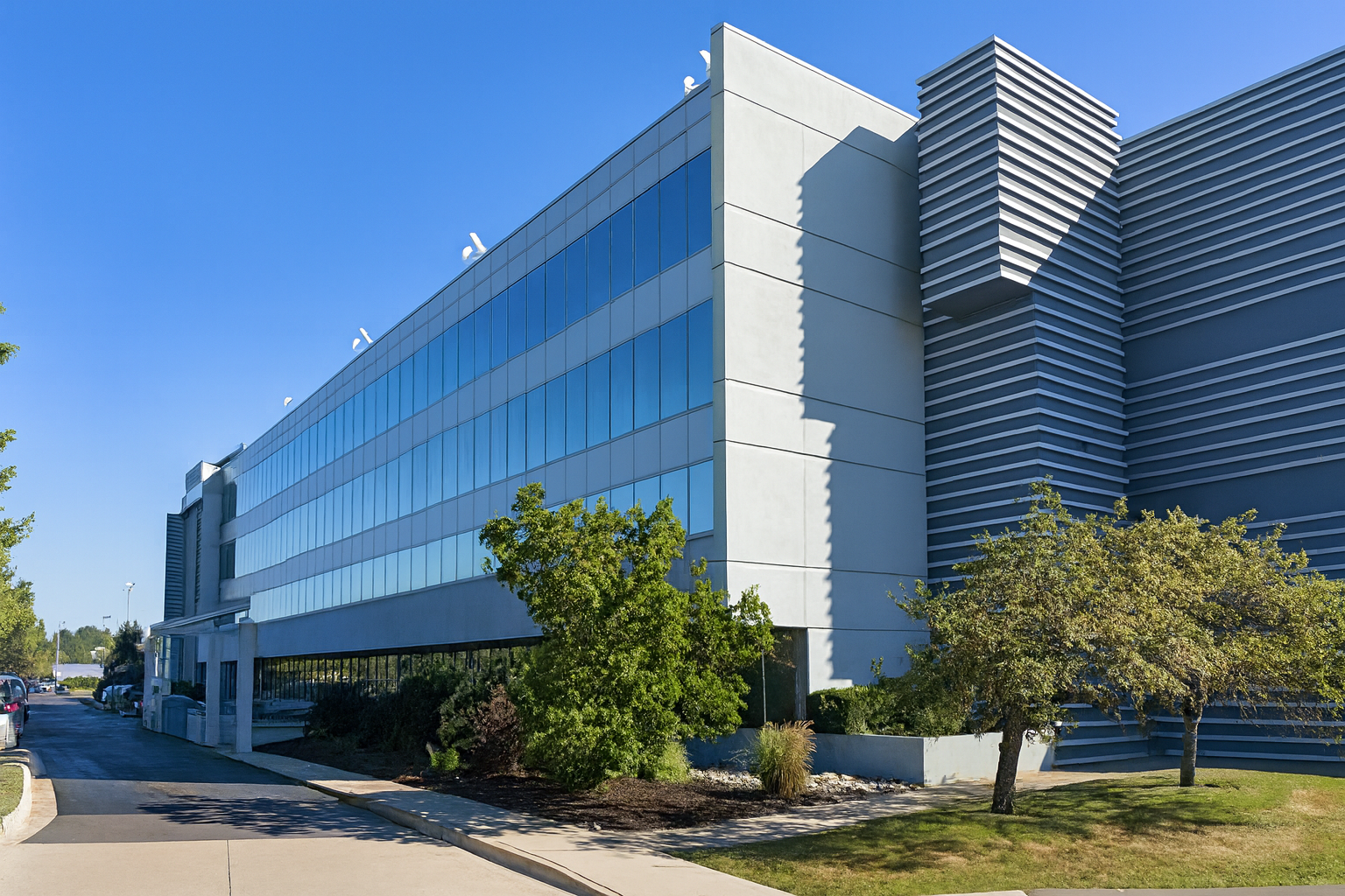
26700 Lahser Rd, Suite # 350,Southfield, MI 48076
IT Certification Training
Hands-on & training-focused


.png)
.png)
.png)
.png)
At Global Information Technology we believe education should fit your career goals not the other way around. That’s why we offer flexible, hands-on training designed to help you succeed in today’s fast-paced IT and healthcare industries.

Our programs are designed to accommodate your busy schedule. With rolling start dates and career-focused certification courses, you can train at your own pace without compromising your current job or personal commitments.

Our instructors aren’t just teachers—they’re industry professionals with real-world experience. They provide hands-on guidance, one-on-one support, and mentorship to help you master the skills needed to excel in your field.

We go beyond the classroom by bringing in guest speakers, industry leaders, and alumni to give you insight into the job market. Our staffing and consulting services also connect you with potential employers to help you land the right job.

Our courses are shaped by an industry advisory board, ensuring that you learn in-demand skills that align with employer needs. From Data Science and Cybersecurity to Cloud Computing and IT Management, we prepare you for today’s top careers.

We offer flexible payment assistance programs to help make your education more accessible. Our career consultants guide you through funding options, job placement support, and career planning—helping you take the next step with confidence.

Your journey with us doesn’t end at graduation. As a Global IT alumnus, you’ll have continued access to learning resources, networking events, and refresher courses. We believe in empowering our students for long-term success, wherever their career path takes them


.svg)


%203.svg)


